All Posts By

juliethomas

Prince Henry’s High School, Evesham re-branding

By recent work includes

Prince Henry’s High School, Evesham, commissionned me to update their image, starting with refreshing their school crest and revitalising their colour scheme.
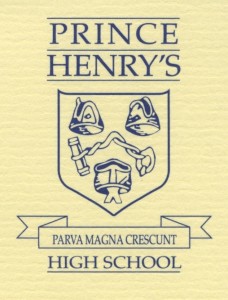
The original crest had been re-drawn so many times over the years, that it was beginning to lose it’s definition.

The original crest had been re-drawn so many times over the years, that it was beginning to lose it’s definition. I re-created it in a format that will be able to be used in all of the necessary formats (stationery, website, prospectus, school signage etc). Once agreed, I then designed a graphic ‘wave’ to work with the crest, using the new colour pallette.

The school was very pleased with the end results and is looking forward toprogressing with the next stages.

Hair raising promotion!

By latest projects, recent work includes

Poppy’s Hair Salon in Malvern has always had an excellent reputation for being a traditional hair salon. Proprietor, Susan Doran, has recently taken on a new stylist, Fiona Baker, who has had extra Wella™ training in creative colouring, including their exciting new 3D Colour Service and has barbering qualifications – both unisex and for all ages.

Susan wanted to raise the salon’s profile, attracting younger customers. I designed a new leaflet and window posters, designed to catch the eye of passing pedestrians. I used modern ‘poppy’ imagery, combined with black and white blocks, which will be used on all future promotions, stationery, cards and adverts and the salon’s new Facebook page.

It’s not what you do…

By latest projects, recent work includes

… It’s the way that you do it!

At the beginning of the Summer, I was asked by one of my clients, Wellie-Web, to re-design their website home page. Nicola and Giles, owners of Cedarstone, have been successfully selling top quality branded wellington boots online for over 7 years. However, the summer months have proved to be a fairly quiet time for them in previous years for obvious reasons.

Their customer base has mainly been the hunting and shooting set. I designed a logo that could be adapted for a variety of colours and could be used as an icon. I also re-designed the home page, aiming it at the Festival goers, encouraging them to buy wellies to match their festival outfit. http://www.wellie-web.co.uk/ making it more colourful and vibrant, giving them easy options to finding their ideal festival footwear and accessories.

It worked! Their sales increased dramatically, and I have now been commissioned to redesign the site ready for the Winter trends… Keep looking!

“At Wellie-Web, one of our on-line stores, we needed help to achieve a much needed ‘make-over’ and to gain a fresh, new look. Julie not only helped us to achieve this but her work has had a positive impact on our customer levels. With this tangible benefit we now have the confidence to follow the same process with our other websites.”
Nicola Palmer, Cedarstone Limited

Gardening Service

By latest projects, recent work includes No Comments

Matt Tedds was setting up a gardening service. He wanted to appeal to local elderly residents who may be struggling with the upkeep of their gardens. I commissioned an illustrator, Owain Kirby, to produce a traditional woodcut illustration of Matt and surrounding garden and hills. Combined with the wording, ‘for gardening done the traditional way’ on postcards and signage, the overall finished design gives the customer a secure feeling, and allows them to have a good idea as to what Matt looks like and what he does, before they meet him.

Chase Hand Book

By latest projects No Comments

Hand Book for the Chase School. Aimed at Middle School pupils and parents, it needed to appeal to both audiences. I used strong colour blocks, and large photographs of happy, busy pupils, keeping the text content light, but informative.