Category

recent work includes

Recent work includes

Craniosacral therapy card

By recent work includes

Craniosacral therapy card

Janne Tooby is a Craniosacral Therapist. Janne wanted a ‘calling card’ that reflects how Biodynamic Craniosacral Therapy works. She loves working alongside individuals who are committed to exploring their own pathway to health. The curved lines represent the journey individuals make during their treatments.

Dementia leaflet and logo

By recent work includes

dementia leaflet

A client who works with people who are being affected by dementia, need a leaflet to leave at local doctors surgeries, care homes etc. It was important that the design and overall look would not scare people, but did reflect the nature of the illness. I used the imagery of, and designed a logo based on a dandelion clock, representing a single unit breaking up, but moving on to become the beginning of something new.


Fashion brand Lookbook

By recent work includes

Rare Lookbook 1Raregoods.co, based in London, needed a Lookbook to give to prospective customers at two fashion exhibitions, one in Berlin and one in Copenhagen. Time was of the essence – less than a week to design, produce, print and deliver a 56 page booklet! The deadline was met and the client was very pleased with the end result.

Raregoods.co create a range of wearable, alternative and versatile garments, aimed at like-minded individuals who share a collective interest in British lifestyle and clothing.

School branding

By recent work includes

Grove School brandingThe Grove Primary School & Nursery wanted to update their branding to reflect it’s unique location and expansive grounds and facilities. I designed a new logo and strap line – ‘Bringing out the best in everyone’, which has been used on new signage around the school and on the new uniforms. I commissioned new photography which I have used for the new school Prospectus. Staff, Governors, parents and pupils have been very happy with their new image.

School Prospectus

By latest projects, recent work includes

Burghill School ProspectusBurghill School in Hereford needed a new Prospectus. The school is in a beautiful rural location, with plenty of outside space for the pupils to thrive. I commissioned a photographer to capture the school’s environment and used large images combined with strong captions on each page.

Large photographic display panels

By recent work includes

Chase panelsThe Chase School wanted to enhance the reception area with large (very large!) photographic display panels. I commissioned a local large format printer to produce four sets of tryptic panels. Each panel measured 3 metres deep by 1 metre wide, making each image 3 metres by 3 metres. The final effect has transformed the area, giving it instant impact when entering the doors. The quality of the photographs is outstanding and the finish is suitable for a busy school environment.

The Chase School, Malvern display panels

By recent work includes

The Chase School needed some cost-effective but eye catching display panels for their reception area. They needed to be portable, so that they could also be used to promote the school and it’s facilities at educational events and Open Days.

I used strong colour blocks and quotes from testimonials to reflect the design on the School’s handbook that I recently produced.

Supplied as bannerstands – with high quality laminated graphic panels on lightstop banner media complete with carry bag, the Chase is so pleased with the panels, they are going to be ordering more very soon!

Prince Henry’s High School, Evesham re-branding

By recent work includes

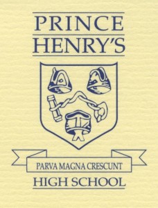
Prince Henry’s High School, Evesham, commissionned me to update their image, starting with refreshing their school crest and revitalising their colour scheme.

The original crest had been re-drawn so many times over the years, that it was beginning to lose it’s definition.

The original crest had been re-drawn so many times over the years, that it was beginning to lose it’s definition. I re-created it in a format that will be able to be used in all of the necessary formats (stationery, website, prospectus, school signage etc). Once agreed, I then designed a graphic ‘wave’ to work with the crest, using the new colour pallette.

The school was very pleased with the end results and is looking forward toprogressing with the next stages.